Each January the PPG Color of the Year team—a 30-plus group of global trend experts—meets to analyze worldwide events and determine the forthcoming Color of the Year. They draw on news impacting industries as varied as the automotive, aerospace, fashion, home decor, and electronics industries. This year’s workshop took place as planned, pre-COVID-19, but in the tumultuous months that followed, the team realized that the year was calling for more than just one hallmark hue.

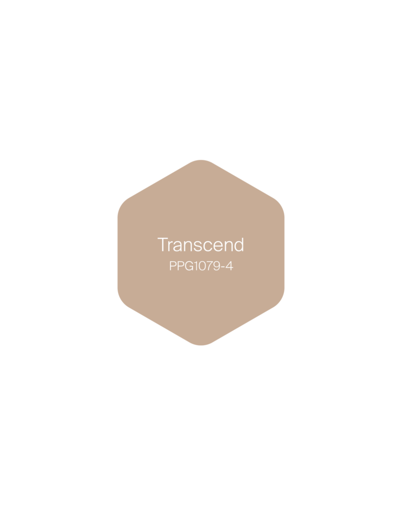
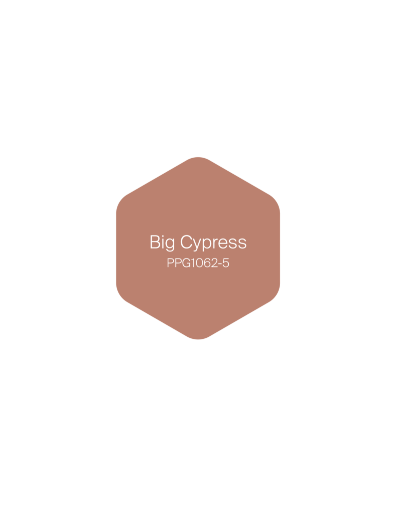
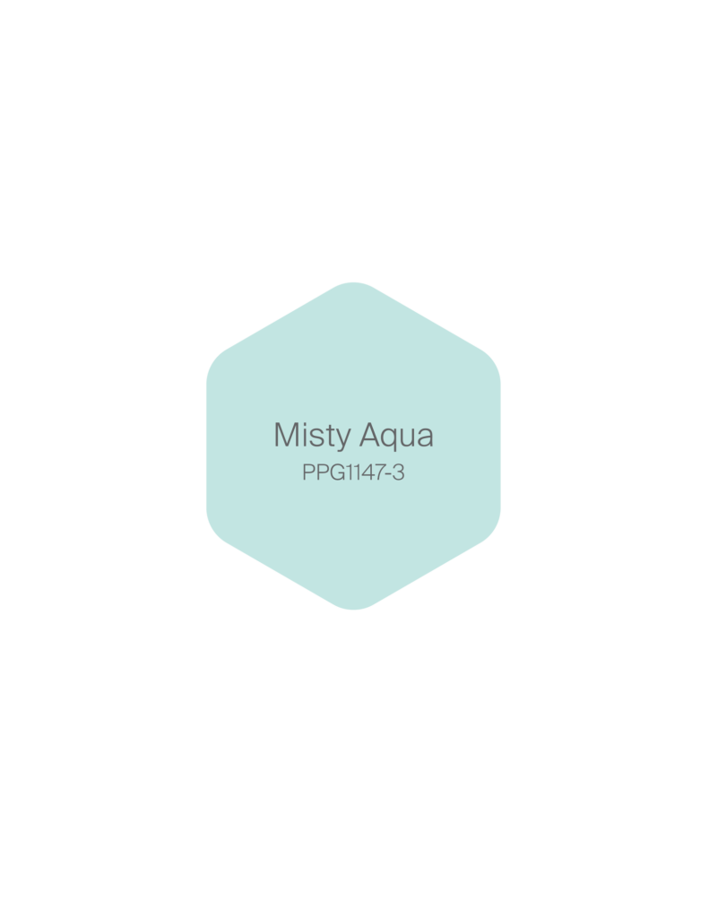
The result? A warm palette that includes three colors of the year: Transcend (PPG calls it “a midtone, shaded, brown sugar beige with a gingerbread undertone”), Big Cypress (“a saturated, shaded, ginger orange with a persimmon undertone”), and Misty Aqua (“a soft, muted, tropical turquoise aqua with an aquamarine undertone”). It’s a palette designed to comfort a socially distanced world in dire need of a hug.
Join AD PRO and save 20% on an annual
“Following our workshop in January, we agreed that an unprecedented year called for a first—a palette of colors. We wanted to ensure that we were providing color in context, and we felt that the best way to do this was to empower consumers with a three-color combination to use in a way that is meaningful to them,” PPG’s senior color marketing manager Dee Schlotter explains of her trend-spotting team’s choices for 2021. The three-palette offering was also designed with what the brand calls the 60-30-10 rule—60 percent of a room decorated or painted with a dominant color, 30 percent with a secondary color, and 10 percent with an accent color.

“When the world experiences events that cause unrest, anxiety, and grief, we tend to naturally gravitate toward compassionate colors that allow us to create a comforting personal retreat from the world. These comfort colors are similar to comfort foods—both offering a certain sense of familiarity and normalcy when facing the unknown.” World events always impact the color trend team—2018 was more of an “angry” year, with moody Black Flame taking the PPG Color of the Year title that year, while last year’s “vibrant, bold blue” of Chinese Porcelain indicated an energetic response to the melancholia of the prior year.
The chaos of this year’s global pandemic, long-term quarantine orders, and social unrest led the PPG team to reconsider the year’s mood with an eye toward the themes of home, nature, and respite. Says Schlotter, “We have begun to crave human connection and embrace simple activities, including walking, hiking, baking, and gardening. This organic and hopeful palette represents what we have been longing for after decades of overstimulation and overconsumption: simplicity and restfulness.”

Officially termed the “Be Well” 2021 Palette of the Year, the main palette is joined by two other color stories: “Be True: Anchoring Reality,” featuring Enchanting Eggplant and “glass-bottle green” Gargoyle, along with the anchor COTY Transcend; and “Be Wild: Activating Optimism,” with periwinkle tone French Lilac and aqua-blue Mediterranean Blue.
All three palettes aim to provide a sense of surety within the home. “Feeling that we have to be resilient while the current unpredictability can drag us down leaves us in between a fragile and agile state,” explains Schlotter.
“To combat this, can we incorporate beauty in our homes to create that visual delight, calmness, or energy. We really believe that walls are the superheroes in any renovation. They can have the most impact on a room’s look and feel.”
